My role
I led the full redesign process, making sure that we streamlined navigation, optimised conversion flows, and aligned design with business goals. This included user research, UX strategy, UI design, and started building a scalable design system. I also managed a small team of UX designers and collaborated with internal stakeholders.
Key Improvements
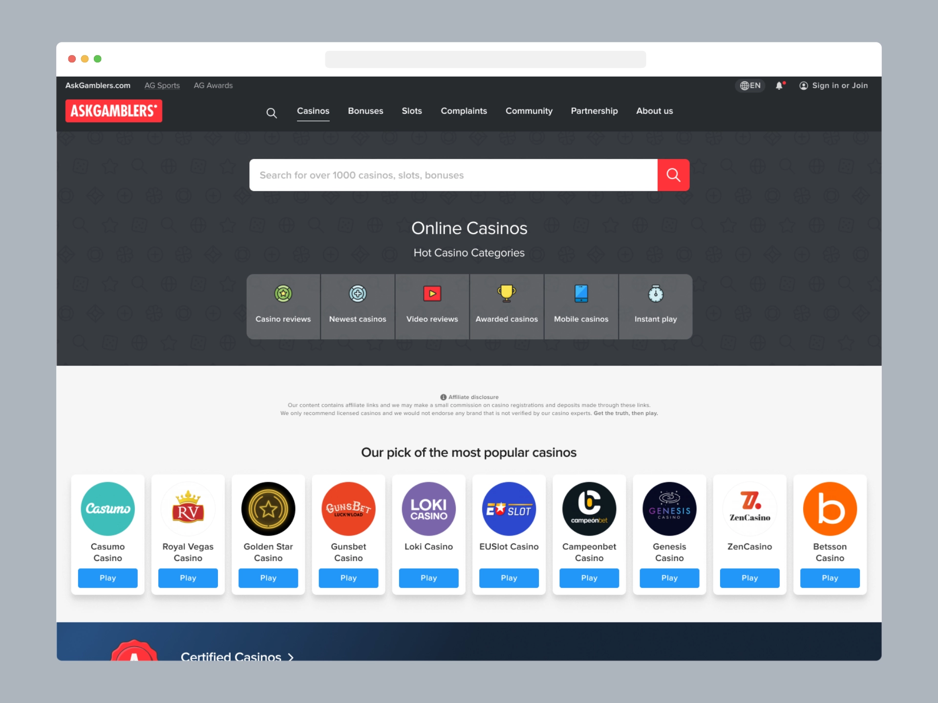
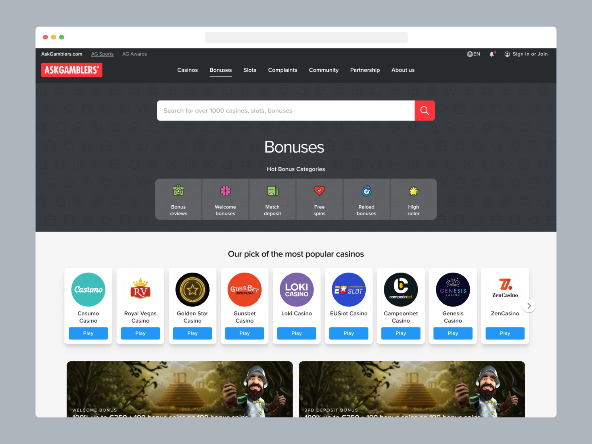
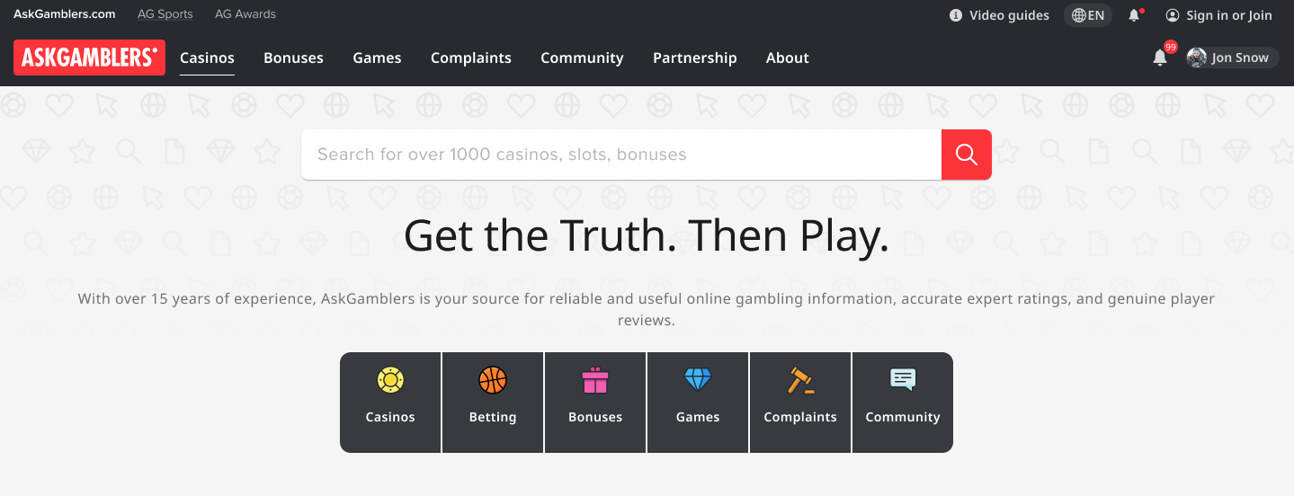
Homepage
The new homepage feels lighter and more focused. It is oriented more towards searching and navigating to specific sections or content of interest.
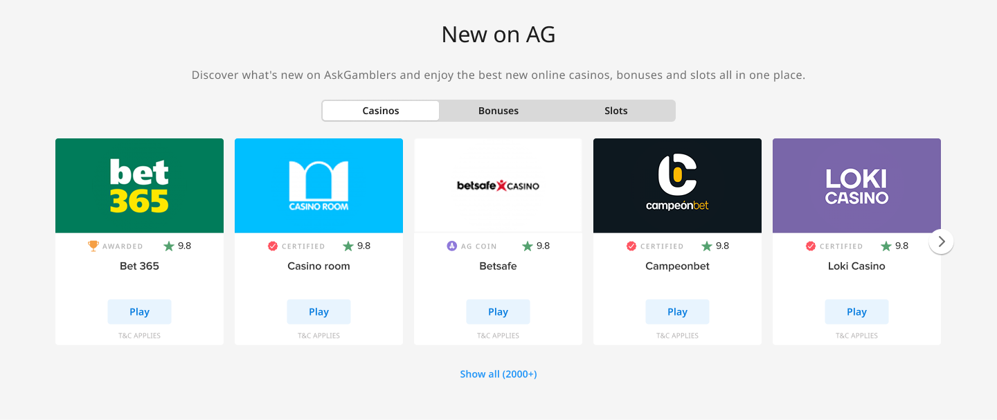
The “New on AG” section replaced multiple repeating blocks for casinos, bonuses, and slots with a single tabbed carousel, making the content more compact and easier to browse.
Card Design
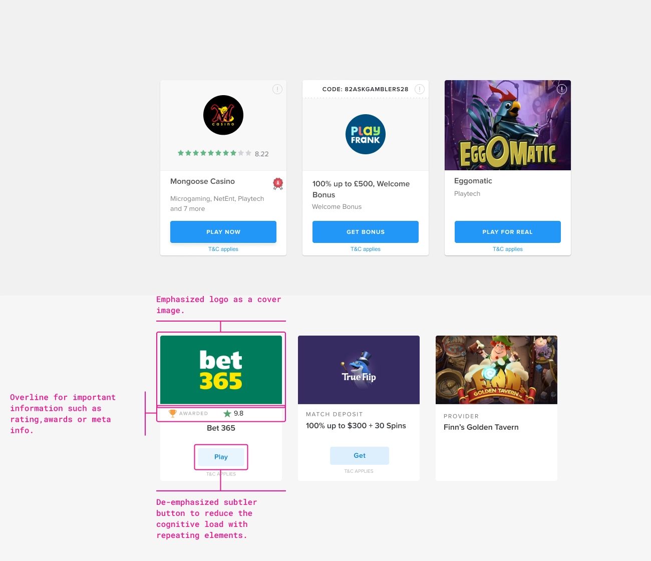
The original cards felt visually outdated and placed too much emphasis on the call-to-action, which came across as pushy when repeated. By reducing the visual weight of the buttons, the goal was to encourage users to read the reviews and make informed choices.
Category Pages
Each section (Casinos, Bonuses, Slots) was redesigned with shared logic.
- Unified visual language
- Better alignment and spacing
- Clearer headings and filters
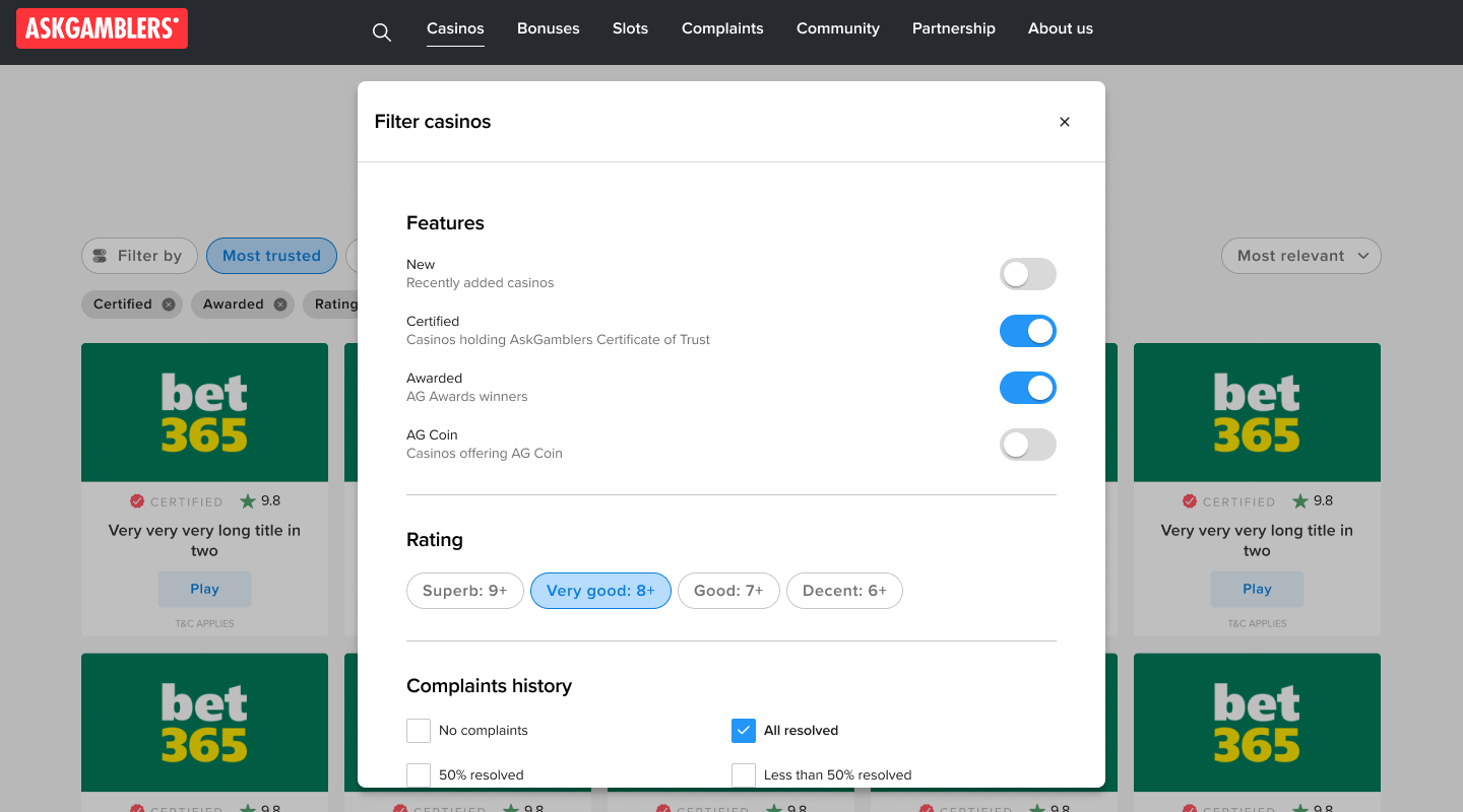
Listing pages with filtering
The listing pages already offered extensive filtering options, but user interviews revealed that the filters were overly complex and difficult to use. At that point, we had no internal data showing which filter properties users engaged with most. To establish a baseline for redesign, I analysed HotJar recordings to understand user behaviour and identify which properties are most useful for the users.
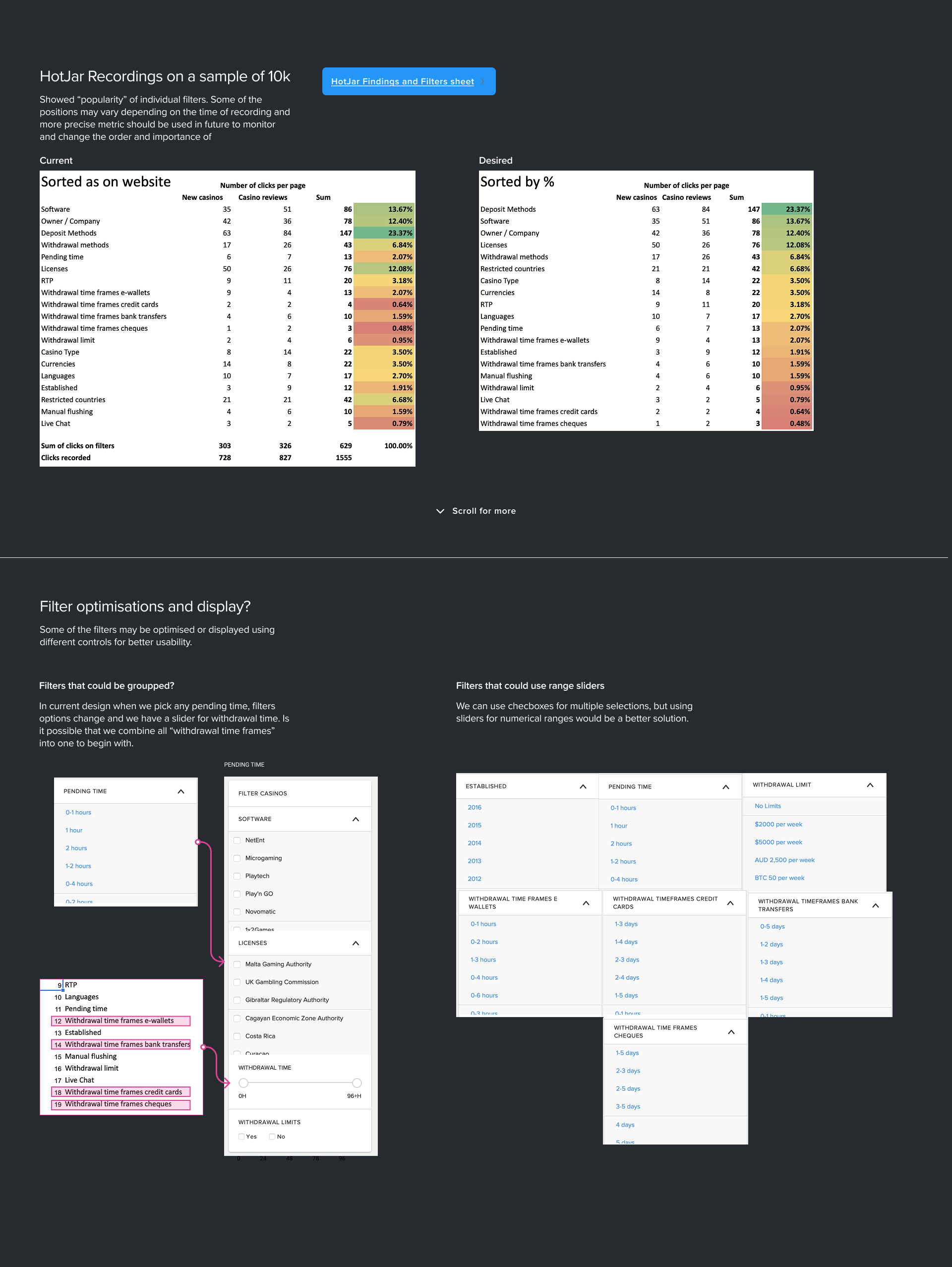
The findings led to a cleaner, horizontal filter bar with visible presets and the most frequently used properties displayed upfront. Less common options were moved into a modal to reduce visual noise. In future iterations, filter properties will be automatically sorted by usage rate, allowing ongoing optimisation based on analytics and user needs.
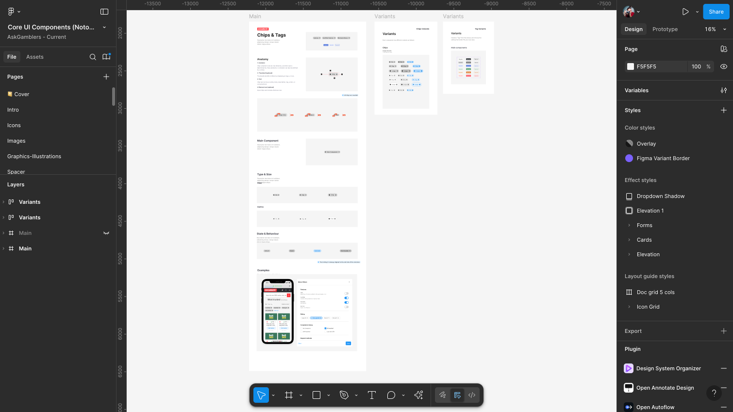
UI Kit
When I joined the team, the interface was built with improvised styles that made every update a struggle. I introduced a proper UI kit to bring order and consistency and migrated the project from Sketch to Figma.
We standardised spacing, typography, and colour across all screens, creating a unified look and feel. By building modular components, the team could finally work faster, maintain designs easily, and scale the product without breaking consistency.