About the client
Skillogs is a French digital learning platform offering an AI-driven learning content management system (LCMS). It supports dual education by integrating adaptive learning, personalised pathways, and certification tools for students and professionals.
The challenge
The platform was originally designed for desktop use. While mobile access was technically possible, the experience was not designed with mobile users in mind.
Key problems identified:
- The information architecture (IA) did not translate well to mobile behaviour.
- Navigation relied on niche patterns, unfamiliar to new users.
- Content layout was not mobile-optimised.
- No native mobile features (offline access, push notifications, mobile gestures).

The Objective
Design and deliver native mobile apps for iOS and Android that allow learners to
Access and complete courses on the go
Track personal learning stats and rankings
Interact with peers through session comments
Receive updates, tasks, and instructions in real-time
Seamlessly link their learning profile with LinkedIn
UX approach
Research and analysis
I started by speaking with key stakeholders to understand their vision for the mobile app and the constraints we had to work within. A heuristic evaluation confirmed that the navigation was unintuitive, the hierarchy was unclear, and the content didn’t read well on smaller screens. There was plenty to fix, but also a clear opportunity.
Information architecture redesign
The navigation adhered closely to the backend content organisation. Although suitable for academic settings and the web app, we needed to reconsider the information architecture and adjust it to align with mobile navigation patterns.
Level
Description
Cohort
A group of learners sharing a schedule and peer progress
Syllabus
A thematic roadmap tied to learning goals
Module
A breakdown of topics within the syllabus
Session
The smallest learning unit with practical tasks and discussions
Content
The material itself: videos, quizzes, articles, resources
After a couple of back and fourth we finally mapped the IA into four core levels, structured for mobile-first use.

This hierarchy helped prioritise navigation flow and break content into digestible units.
Design solutions
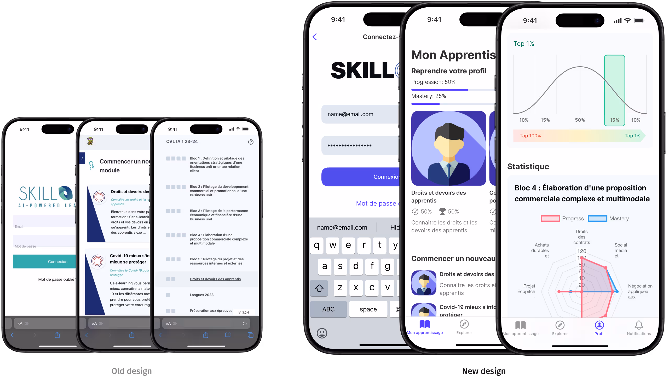
Mobile first navigation
Replaced the niche menu with a bottom tab bar for direct access to:Home, progress, leaderboard, news, and profileIntroduced persistent progress indicators for quick orientation
Profile and gamification
A personal dashboard was designed to display key learning metrics, including achievements, course completion status and leaderboard ranking. LinkedIn integration was also added, allowing users to export and share their certifications. The aim was to make progress easy to track and recognition simple to share.
Content adaptation
All learning materials were reworked for mobile use. This included implementing responsive layouts, scalable typography, and touch-friendly interactions to improve readability and navigation on smaller screens.
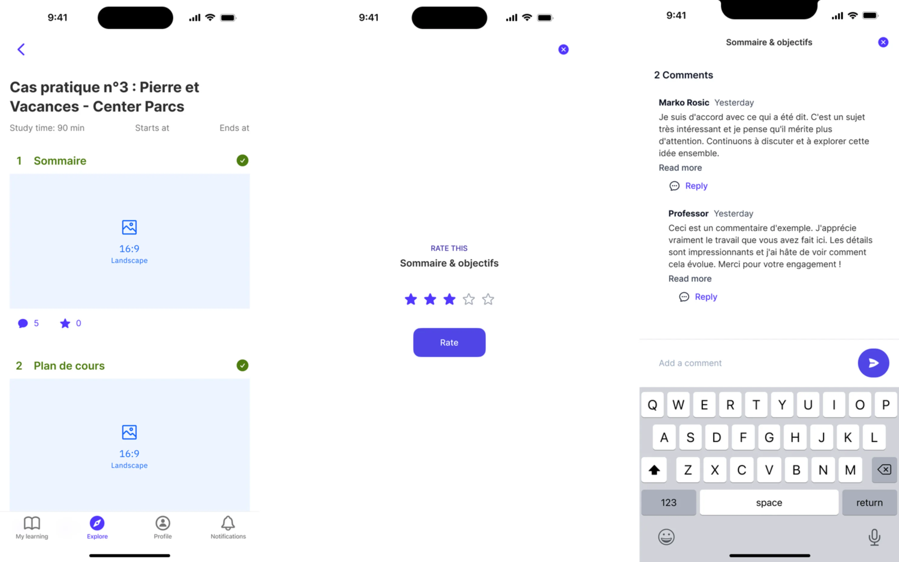
Social interaction & feedback
Commenting and feedback features were added directly to content, allowing learners to share thoughts and report issues in context. A simple rating system was introduced to collect user input, helping identify what worked well and where improvements were needed. This created a continuous feedback loop to refine the learning experience.